
Brooklyn Nets Rebrand
Project: Brooklyn Nets Rebrand Case Study
Role: Creative Direction, Art Direction, Designer, Branding, Fan
Industry: Sports
Timeline: 2 Weeks
Year: 2026
Tools: Adobe Illustrator, Photoshop, Premiere, and After Effects
This is a concept project and not affiliated with the NBA or the Brooklyn Nets.The Creative Process
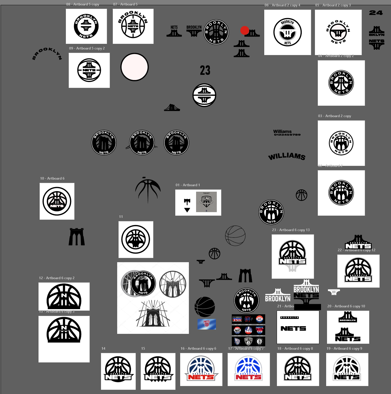
What began as a simple digital sketch exploring ideas for rebranding the Nets has evolved into a full creative process. Below is a screenshot of my Illustrator workspace as I developed various concepts along the way. I skipped the traditional freehand sketching phase and went straight to digital, iterating until I arrived at the final logo.
This video walks through the design thinking behind the brand identity and cohesive vision.
The Full Picture
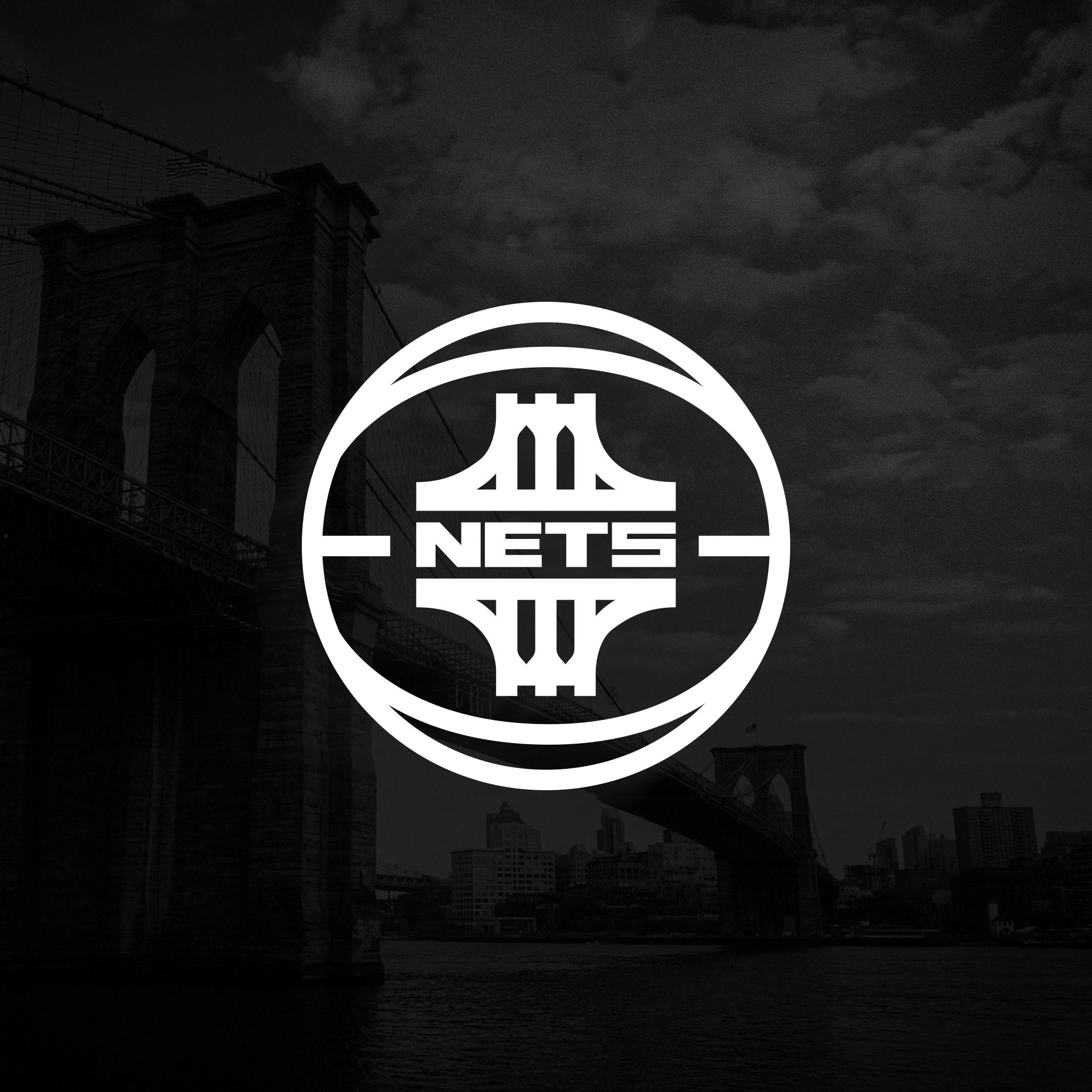
The primary logo aligns with the NBA's current branding direction, reflecting the league-wide shift toward unified, shape-contained marks that integrate the city name, team name, and a unifying identity element. The alternate logo features a refined line-art treatment, with the basketball forming the outer boundary and a bridge/net icon framing the wordmark. The "Nets" and "Bridge" wordmark lockup incorporates the icon behind each word as a structural design element. These marks will be applied across both home and away uniforms.
Logo & Alternates
Main Logo
Alternate Logo
Nets Wordmark
Bridge Wordmark
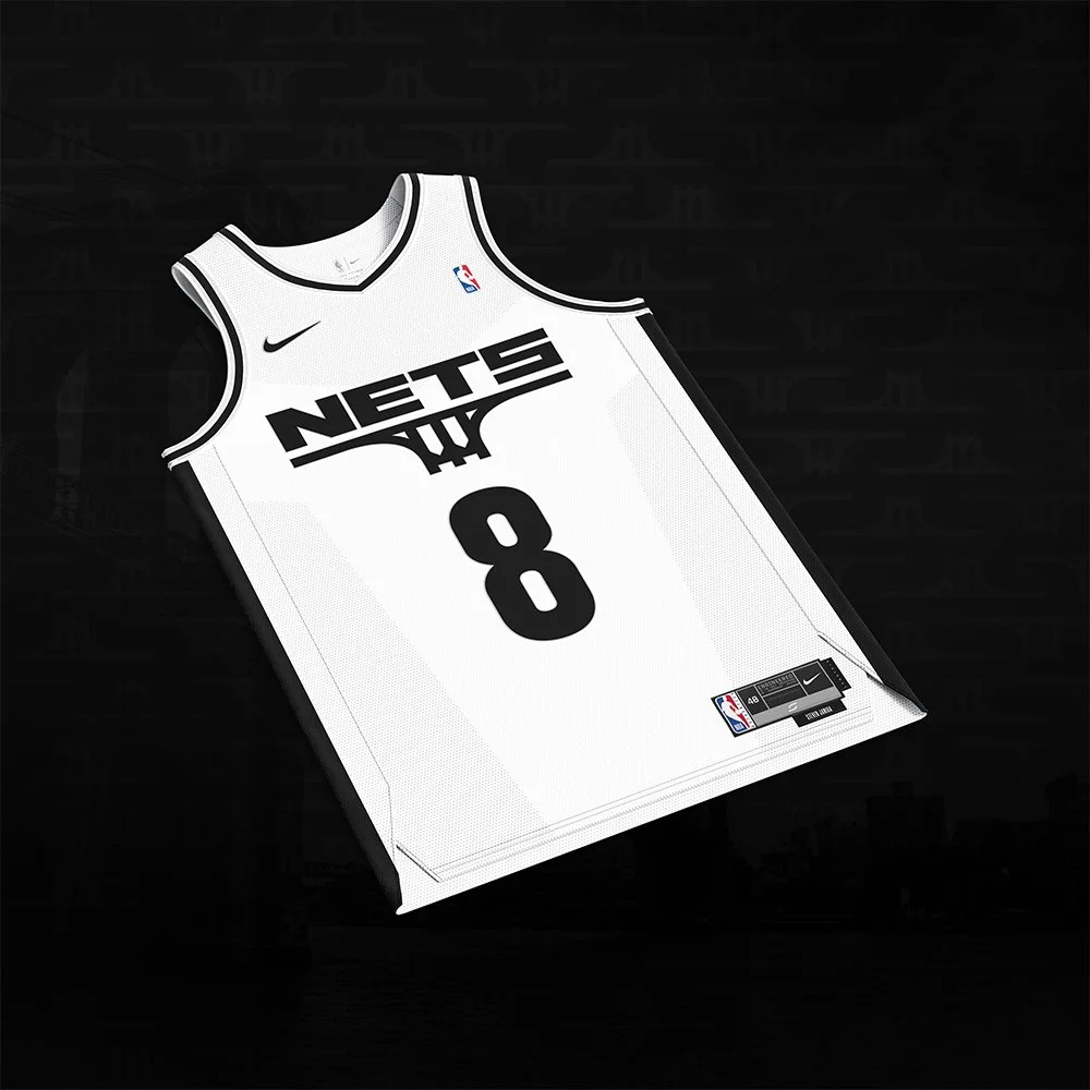
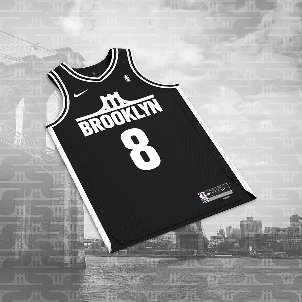
Traditionally, NBA home jerseys feature the team name, which inspired the white home uniform and its “Nets” wordmark. Away uniforms typically highlight the city, so the black away jersey incorporates the “Bridge” wordmark as a nod to Brooklyn’s identity and culture.
Jersey Designs
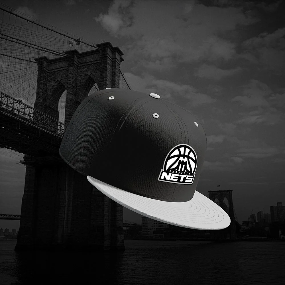
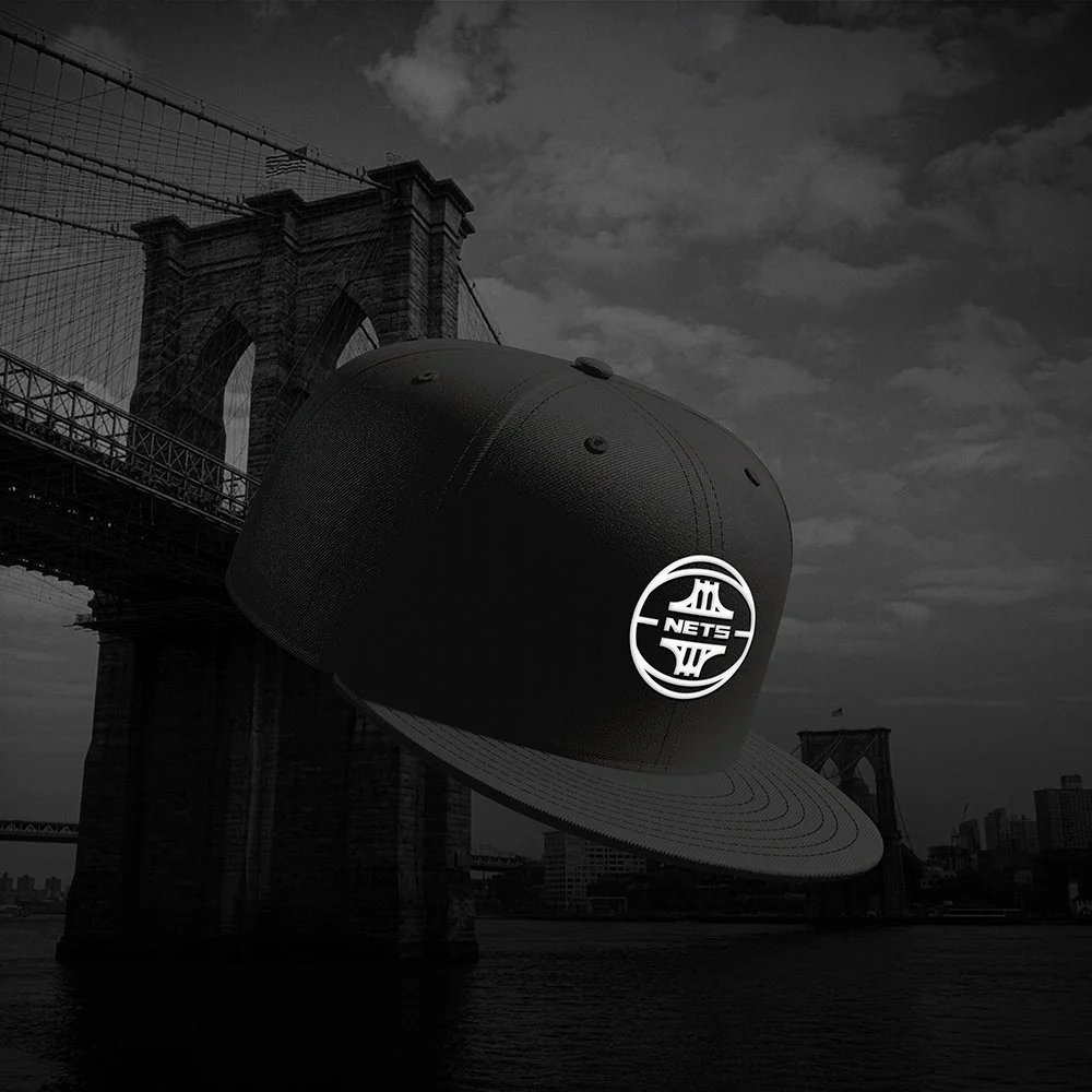
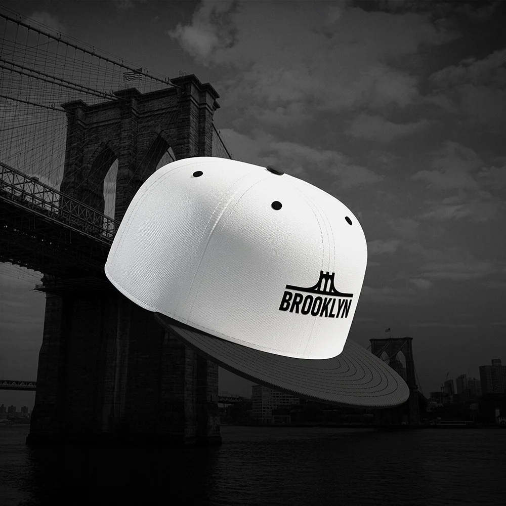
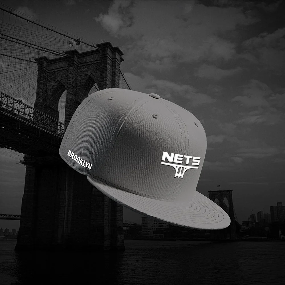
Headwear is where sports branding lives closest to streetwear, and this concept treats it that way. Clean embroidery and colorways that nod to the borough.
Hat Designs
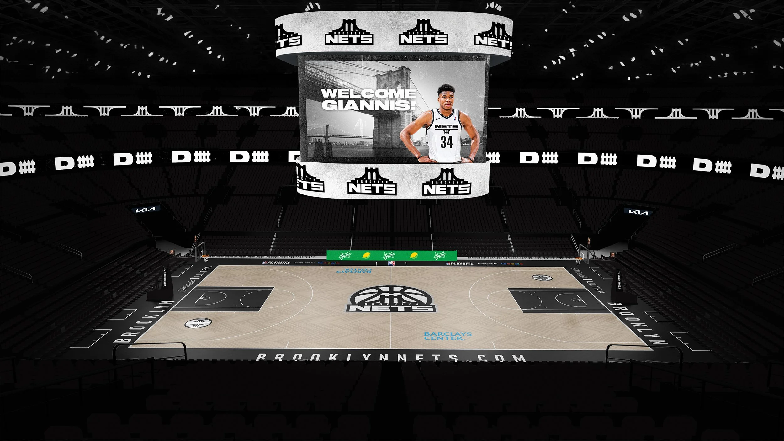
Court Design
The Barclays Center, reimagined. The primary mark owns center court while the alternate logos anchor the baselines, bringing the full identity system to the biggest stage at Barclays. Advertisements shown for concept purposes only and are not affiliated.
This motion piece captures the energy and attitude behind the city of Brooklyn. The typography and bridge move like the constant sound of the city. The goal was to make Brooklyn feel like it hits different every time it shows up on screens and broadcasts.